Pay, Click, Done: How Stripe, Shopify, and PayPal Rewired the Way America Buys Online
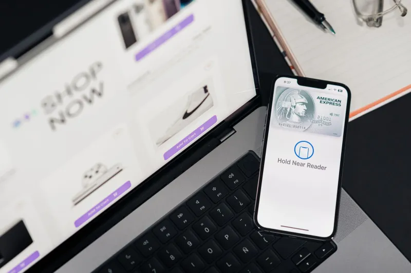
Not long ago, buying something online felt like filing taxes. You'd enter your shipping address, then your billing address, then your card number, then your card's expiration date, then a CVV code you'd inevitably have to go find your wallet for. Then you'd hit submit and wait — sometimes for a spinning loader, sometimes for an error message telling you the zip code format was wrong.
That experience is largely gone now. And it didn't disappear by accident.
Stripe, Shopify, and PayPal spent the better part of the last five years in a quiet arms race to own the moment between "I want this" and "I bought this." The winner gets transaction data, merchant loyalty, and a slice of every sale. What they built along the way reshaped e-commerce UX more dramatically than almost anything else on the web — and most people using these platforms have no idea how intentional every pixel of that experience actually is.
The Abandonment Problem Was Always a Design Problem
Cart abandonment rates in the US have historically hovered around 70 percent, depending on the industry. That stat gets cited constantly, but what's less discussed is why people bail. Baymard Institute's research consistently points to the same culprits: forced account creation, overly long checkout forms, unclear shipping costs surfacing too late, and a general sense of distrust at the payment step.
All three platforms attacked these problems, but from different angles.
Shopify's approach was to compress the entire checkout into the fewest possible screens. Shop Pay — their accelerated checkout product — stores a buyer's info after their first purchase anywhere in the Shopify ecosystem, then auto-fills everything on future purchases across any Shopify-powered store. It's frictionless in a way that feels almost unsettling the first time you experience it. One tap, done. Conversion rates on Shop Pay reportedly run 15 to 36 percent higher than standard guest checkout, according to Shopify's own published data.
PayPal's angle was trust. Their brand recognition meant that showing the PayPal button at checkout acted as a credibility signal, especially on smaller or lesser-known storefronts. They've leaned into this with their "Pay Later" (BNPL) integration, which surfaces financing options directly in the checkout flow without redirecting users. The psychological effect is real: seeing a monthly payment amount instead of a total lump sum reduces perceived cost and lowers resistance.
Stripe went after developers first, merchants second, and consumers almost by proxy. Their Stripe Checkout and Payment Element products are extraordinarily configurable, which means the brands using Stripe can create checkout experiences tailored to their specific audience. But the real move was Link — Stripe's own saved-payment network — which functions a lot like Shop Pay but lives across Stripe-powered sites rather than just Shopify's ecosystem.
The Interface Details That Actually Drive Conversions
Look closely at a modern Stripe-powered checkout and you'll notice something: the credit card field now auto-detects card type as you type and adjusts the card icon in real time. It sounds trivial. It isn't. That micro-interaction reduces input errors and, more importantly, signals to the user that the form is responsive and alive — which subtly reinforces the sense that the transaction is secure.
Shopify's checkout redesign (rolled out broadly to merchants in 2023) introduced a three-column layout on desktop that keeps the order summary always visible while the user fills out their information. It sounds like a small thing, but it addresses a specific anxiety: "Am I buying the right thing?" Keeping the cart in view eliminates the impulse to go back and check.
PayPal's most underrated design decision was normalizing the redirect-and-return flow. Years ago, being sent to PayPal's site to authenticate felt disruptive. They invested heavily in making that redirect feel instantaneous and returning users to the merchant's confirmation page without a jarring transition. The seam is nearly invisible now.
The Data Play Underneath All of It
Here's the part that doesn't make it into the product announcements: every one of these platforms is building a behavioral dataset that gets more valuable with every transaction.
When Shopify knows that a particular buyer completes purchases 80 percent of the time when they see free shipping, that insight informs how merchants are coached to price and present offers. When Stripe sees that a certain card type has a higher decline rate at a specific price point, they can surface alternative payment methods proactively. When PayPal tracks which BNPL offers convert on which product categories, they refine which merchants get promoted in their app's discovery features.
The checkout isn't just a payment screen anymore. It's a data collection event dressed up in UX clothing.
What Smaller Businesses Can Actually Use
You don't need Shopify's infrastructure or Stripe's engineering team to borrow from what they've built. A few principles translate directly to any e-commerce operation:
Surface your total cost early. Don't wait until the final confirmation step to show shipping fees. Baymard's research is unambiguous — surprise costs are the single biggest driver of abandonment. If you can show estimated shipping on the product page or cart, do it.
Reduce required fields aggressively. Audit every field in your checkout and ask whether it's truly necessary before the purchase completes. Phone number? Do you actually need it at checkout, or can you collect it post-purchase? Every field you remove increases completion rates.
Use social proof at the payment step. This is something the big platforms do implicitly through brand recognition. Smaller stores have to be more explicit — a line like "256-bit SSL encryption" or a recognizable trust badge near the submit button costs nothing and measurably reduces hesitation.
Test an accelerated checkout option. Shop Pay, PayPal Express, and Apple Pay are all available to most US merchants regardless of platform. Offering at least one one-tap option for returning customers is table stakes at this point.
The checkout experience was broken for a long time, and a handful of companies decided to fix it — not out of altruism, but because every improvement they made directly increased their own revenue. The upside for everyone else is that the tools they built to do it are now widely available. The only question is whether you're actually using them.